


I tested several tools, and my research points to these as the best spreadsheet software: Google Sheets, Microsoft Excel, Apple Numbers, Zoho Sheet, Detrics, Coefficient, Jotform Tables, and Minitab Statistical Software.
There are two types of people in this world: those who see a blank spreadsheet and panic, and those who see infinite possibilities. I used to be the latter until a poorly formatted dataset, a rogue formula, and a sluggish cloud sync conspired against me on the same afternoon.
If you’ve ever watched your carefully crafted formulas implode because of one misplaced character or tried to collaborate on a document only to find someone has mysteriously deleted an entire column, you know the struggle of not working with a spreadsheet tool.
Spreadsheets are supposed to make life easier, but pick the wrong tool, and suddenly, you’re in an endurance test of patience and CTRL+Z reflexes. After one too many near-breakdowns, I decided to test different spreadsheet tools to see which ones could handle the chaos of my daily work. Some solutions handled massive datasets like a dream. Others made collaboration feel effortless. And a few? Let’s just say they reminded me why people still print things out.
If you live and breathe spreadsheets or just want a tool that won’t betray you, my list of best spreadsheet software breaks down the 8 top solutions I tested, what they excel at, and which one might save you from a data-induced meltdown.
8 best spreadsheet software for 2026: My top choices
- Google Sheets: Best for real-time collaboration and cloud native integration
For teams needing simultaneous co-editing and seamless integration with the entire Google Workspace ecosystem. (Free for individuals; Paid plan for Google Workspace starts at $7/user/month) - Microsoft Excel: Best for powerful data analysis and financial modeling
For professionals requiring advanced pivot tables, robust formulas, complex financial modeling, and extensive data visualization capabilities. ($9.99/month with Microsoft 365; $179.99 for a one-time purchase) - Apple Numbers: Best for creative and visually appealing data presentation
For users focused on design, offering visually rich templates, flexible canvas layouts, and integration with Apple’s ecosystem. (Free) - Zoho Sheet: Best for integrating with other Zoho apps and data automation
For businesses using the Zoho ecosystem that want collaborative spreadsheets, automated workflows, and connected business data.(Free for individuals, $4/user/month) - Detrics: Best for automating marketing data pipelines into Google Sheets and Looker Studio
For marketers and agencies looking to automate reporting by syncing advertising data directly into spreadsheets and dashboards. (Starts at $10.99/month for Looker Studio) - Coefficient: Best for connecting spreadsheets directly to business data
For revenue operations, finance, and analytics teams that need live CRM and business data inside Google Sheets or Excel. ($59/month) - Jotform Tables: Best for organizing form submissions automatically
For teams collecting applications, registrations, surveys, or intake forms that want submissions organized into structured, easy-to-manage tables. (Free; Paid plans start at $34/month) - Minitab Statistical Software: Best for statistical analysis and quality improvement
For analysts and engineers needing specialized tools for complex statistical tests, hypothesis testing, regression, and quality control charts. ($2394/year)
*These spreadsheet software solutions are top-rated in their category, according to G2’s Summer 2026 Grid Reports. I’ve also added their monthly pricing information wherever available to make software comparison easier for you.
8 best spreadsheet software
Spreadsheet software is the tool I can’t escape, mostly because I don’t want to. It’s where I plan, organize, and analyze everything from marketing metrics to content schedules. At its simplest, it’s just a grid of rows and columns. But in reality? It’s a financial tracker, a reporting powerhouse, a calculator, a lightweight database, and occasionally a last-minute problem solver when no other software can do exactly what I need.
And I’m clearly not the only one relying on it. The spreadsheet software market reached $11.56 billion in 2025 and is expected to grow to $15.89 billion by 2030 at a CAGR of 6.3%. That growth makes sense to me. Spreadsheets have moved far beyond basic number-crunching, with automation, advanced formulas, real-time collaboration, AI assistance, and database-like functionality becoming part of everyday workflows.
I’ve used spreadsheets for everything from budgeting ad spend to tracking marketing performance, and I’ve seen them morph into full-blown systems for managing projects, reports, and team workflows. The best spreadsheet software isn’t just a place to dump numbers; it helps you make sense of them, spot patterns, and, hopefully, avoid costly mistakes.
Whether you’re crunching data, managing workflows, or just trying to stay organized, the right spreadsheet software can make a real difference. The wrong one? Let’s just say I’ve lost enough unsaved work to know better.
How did I find and evaluate the best spreadsheet software?
I used G2 Grid Reports to see which spreadsheet software ranked highest based on real user feedback. I used AI to comb through thousands of reviews, paying close attention to comments about usability, performance, collaboration features, and how well each tool handled large datasets and complex formulas.
From there, I tested each spreadsheet tool myself. I built sample reports, imported messy datasets, ran formulas, and pushed collaboration features to their limits. I looked at how easy it was to automate workflows, whether the software slowed down under pressure, and how smoothly it integrated with other tools.
In cases where I couldn’t personally test a tool due to limited access, I consulted a professional with hands-on experience and validated their insights using verified G2 reviews. The screenshots featured in this article may include those captured during testing and those obtained from the vendor’s G2 page.
My formula for finding the best spreadsheet software
I wasn’t just looking for a spreadsheet that worked. I wanted one that made my job easier. So, I put the best spreadsheet software through the wringer, testing everything from speed to collaboration to how well they handled messy, real-world data.
- Performance and scalability: I’ve worked with spreadsheets that beg for mercy when you dump too much data into them. So I stress-tested each tool by importing large datasets — tens of thousands of rows, calculations running in the background, real-time collaboration in progress. A great spreadsheet tool shouldn’t just work for a few hundred rows; it should be able to handle heavy formulas, live data imports, and multiple users editing at once without turning into a frozen nightmare.
- Formula capabilities and automation: Basic addition and subtraction are fine for grocery lists, but I needed something that could handle complex formulas, nested logic, and automation that saved me from repeating the same task. I tested how well each tool supported advanced formulas like INDEX/MATCH, ARRAY FORMULA, and custom scripting. Some tools even let me set up automated workflows, like triggering emails when a threshold is met or pulling real-time financial data from external sources.
- Collaboration and version control: Spreadsheets are rarely a solo sport. I tested how easy it was to work with a team: can multiple people edit at once without things breaking? What happens when someone deletes a formula they definitely shouldn’t have touched? I also dug into version history, testing whether I could roll back changes easily. The best spreadsheet software made it impossible for a rogue teammate to break my workflow.
- Integration and connectivity: I find a spreadsheet that exists in isolation useless. I needed a spreadsheet tool that imported data from CRMs, APIs, and live databases without forcing me to update everything every five minutes manually. I tested how well each software tool connected with other tools, whether through built-in integrations, add-ons, or automation platforms. The best ones let me pull in real-time data, sync with cloud storage, and even automate repetitive reporting tasks with a few clicks.
- Data visualization and reporting: Numbers are great, but if I can’t quickly turn them into charts, pivot tables, or dashboards that make sense, what’s the point? I tested how flexible each spreadsheet software was with graphs, conditional formatting, and advanced reporting features. If a spreadsheet made it easier to spot trends, highlight key metrics, and present data in a way that tells a story, it scored major points.
- Advanced features: Beyond the basics, I looked for spreadsheet tools that offered features that weren’t just “nice to have” but improved my workflow. Some of the standout capabilities I tested included database-style functionality, AI-powered insights, formula suggestions, no-code automation, etc.
The best spreadsheet software didn’t just handle numbers — it extended what I could do with them, making my work more efficient and, honestly, a lot less frustrating. After testing over 30 tools over several months, I have my final cut.
The list below contains genuine user reviews from G2’s best spreadsheet software category. To be included in this category, a solution must:
- Provide review and editing tools
- Filter data for future analysis
- Provide data presentation functions, such as charts and graphs
- Offer collaboration and sharing tools
- Provide convertible files
*This data was pulled from G2 in 2026. Some reviews may have been edited for clarity.
1. Google Sheets: Best for real-time collaboration and cloud native integration
I’ve used Google Workspace for years, but I wanted to test Google Sheets beyond my usual content calendars, budget trackers, and “where did that number come from?” marketing reports.
The first thing I tested was collaboration, and this is where Sheets still feels hard to beat. I had multiple people edit the same file, added comments, used @mentions, and protected key ranges to avoid accidental changes. Everything updated in real time, and collaborative editing is rated 95% on G2, which tracks with how smooth the experience felt.
I also liked how naturally Sheets fits into cloud-based work. Autosave, which is rated 96% on G2, worked quietly in the background while I moved between files, tabs, and devices. Multi-device functionality is also rated 93%, and I found that useful when switching from my laptop to another screen without having to think about versions or downloads.
Automation was the next big plus. I tested macros, Apps Script, IMPORTRANGE, and IMPORTXML to move data around and pull live information into a sheet. Gemini also helped me summarize trends and spot underperforming areas with simple prompts. I still reviewed the output, but it gave me a faster starting point than building every formula from scratch.
That said, Sheets is better suited for light to mid-sized datasets than heavy-duty spreadsheet modeling. In my testing, larger files with lots of formulas and pivot tables started to slow down. Some G2 reviewers mention the same thing, especially when working with bigger sheets, so I’d use it more for collaborative reporting than enterprise-scale analysis.
Offline access is another area where I’d plan ahead. Sheets does support offline editing, which is helpful in a pinch, but some G2 users say syncing or working with larger files can feel less consistent without a strong connection. For a cloud-first tool, that trade-off makes sense, but I’d keep critical work online whenever possible.
I’d recommend Google Sheets for teams that care most about collaboration, easy sharing, and cloud-based workflows. It may not replace heavier spreadsheet tools for complex modeling, but for everyday reporting, planning, and team projects, it keeps the work moving without turning version control into a full-time job.
What I like about Google Sheets:
- I liked how easy it was to collaborate in real time, especially with comments, @mentions, and protected ranges keeping everyone on the same page.
- I appreciated how dependable the cloud experience felt, from autosave to switching devices without worrying about the latest version.
What G2 users like about Google Sheets:
“Multiple people editing the same document or spreadsheet at the same time without version conflicts. Comments, mentions, file sharing, and meetings all connect naturally. Everything runs in the cloud: no installations or heavy maintenance.”
– Google Workspace review, Dileep K.
What I dislike about Google Sheets:
- Some G2 reviewers mention slower performance with larger or more complex sheets, so I’d keep it focused on collaborative reporting and everyday analysis.
- G2 users also note that offline work can be less smooth for bigger files, but it works well enough for quick edits when connectivity is limited.
What G2 users dislike about Google Sheets:
“The main downside is that Google Workspace works best when everything stays inside the Google ecosystem. When we need to collaborate with people or organizations that mainly use Microsoft Office or other tools, sometimes formatting, permissions or file compatibility can become less smooth.
Some settings, especially admin and sharing permissions, can also be a bit complex at first. It is not a major problem, but it requires some attention to make sure files and folders are shared with the right people and not more broadly than intended.”
– Google Workspace review, Francesco P.
Spreadsheets are great for crunching numbers, tracking data, and even managing projects — until they aren’t. A free project management tool may be the right step if you’re juggling multiple tasks, deadlines, and team collaborations. Check out my recommendations now!
2. Microsoft Excel: Best for powerful data analysis and financial modeling
I’ve always seen Microsoft Excel as the spreadsheet tool that can do almost everything, provided you know where to look and don’t get personally victimized by the ribbon.
I started by loading a dataset with over 500,000 rows to see how Excel handled heavy analysis. It barely flinched. Filtering, sorting, pivot tables, and formula-heavy calculations stayed smooth, which matched Excel’s 95% G2 rating for meeting requirements.
Excel’s core spreadsheet features also stood out during testing. Functions and tables are both rated 95% on G2, while filtering is rated 93%, and I could see why. I built formulas, structured tables, and filtered messy data quickly without feeling like the tool was fighting me.
The more advanced tools are where Excel really separates itself. Power Query made cleaning and merging raw CSV files much easier, while Power Pivot helped me connect related datasets across sheets. I also tested VBA and Power Automate for recurring reports, and once the setup was done, the time savings were real.
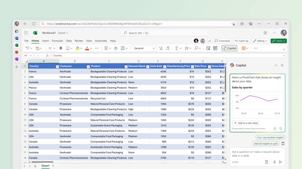
Even so, collaboration is still not Excel’s strongest area. Excel for Web supports real-time editing, but in my testing, it did not feel as instant as Google Sheets. Some G2 reviewers mention similar friction around sharing and co-editing, though OneDrive and SharePoint make it more workable for teams already using Microsoft 365.
Excel can also feel demanding when files get very large or formula-heavy. G2 users mention that performance can depend on the machine they’re using, especially with complex workbooks. I noticed this more on an older laptop, but on a stronger setup, Excel handled heavier analysis much better.
I’d recommend Microsoft Excel for teams that need serious spreadsheet power, especially for financial modeling, data cleanup, reporting, and advanced analysis. It has a learning curve, but once you know your way around it, Excel feels less like a spreadsheet and more like a full data workstation.
What I like about Microsoft Excel:
- Large datasets felt much less intimidating in Excel. I could stack pivot tables, formulas, and filters without worrying that the workbook would buckle halfway through.
- Power Query and Power Pivot gave me the kind of control I’d want for serious reporting, especially when cleaning messy data or connecting multiple tables.
What G2 users like about Microsoft Excel:
“As a Data Analyst, Excel is one of the tools I use every day for cleaning data, validating reports, and performing quick analysis before building dashboards. Features like PivotTables, XLOOKUP, Power Query, conditional formatting, and formulas save a lot of time. I also like how easily I can export data from different systems and collaborate with teammates using a format everyone understands.”
– Microsoft Excel review, Jai C.
What I dislike about Microsoft Excel:
- G2 reviewers note that real-time collaboration can feel less seamless than cloud-first tools, but it works better when teams are already set up on OneDrive or SharePoint.
- Some G2 users mention slower performance with very large or complex files, though Excel is still a strong option when paired with the right system and setup.
What G2 users dislike about Microsoft Excel:
“Excel is a great tool overall, but I think it could improve its performance when working with very large files, as they can sometimes become slow or unresponsive. I’d also like to see easier collaboration features with fewer version conflicts, a more intuitive way to troubleshoot complex formulas, and more AI-powered assistance for cleaning and analyzing data. These improvements would make it even more user-friendly.”
– Microsoft Excel review, MD Quadir Ali
3. Apple Numbers: Best for creative and visually appealing data presentation
Apple Numbers is the spreadsheet tool I’d pick when the spreadsheet needs to look less like a data dump and more like something I can actually present. It’s designed with simplicity and visual presentation in mind, making it a solid choice for users who care about how their data looks as much as what it says.
The freeform layout stood out first. Instead of working inside one endless grid, I could place tables, charts, text, and images wherever I wanted on the canvas. I tested this by building a marketing budget report with separate sections, and it felt closer to designing a report than wrestling with columns.
Numbers also makes simple spreadsheet work feel very approachable. Its ease of setup is rated 95% on G2, and that matched my experience. I could start from a template, adjust layouts quickly, and use basic formulas without needing to hunt through menus like I was solving a mystery.
I also liked the visual side of the tool. Charts and graphs are rated 90% on G2, slightly above the category average, and the finished reports looked polished without much effort. I tested interactive charts and tables, and they worked especially well for dashboards, summaries, and presentation-ready updates.
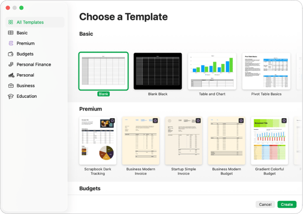
Collaboration was smooth when I stayed inside the Apple ecosystem, but that’s also where the boundary showed up. Editing through iCloud worked well on Mac, iPad, and iPhone, while G2 reviewers mention that sharing with non-Apple users can be less straightforward. For mixed-device teams, I’d map out the workflow before making it the default spreadsheet tool.
Numbers also keeps things simpler on the automation side. Some G2 users call out limited add-ons and more basic automation options, which tracked with my testing. It’s great for clean reporting and everyday planning, but Excel or Google Sheets gives you more flexibility for complex workflows.
I’d recommend Apple Numbers for Mac-heavy teams, freelancers, and anyone creating visual reports, dashboards, or simple trackers that need to look polished. It may not be the most powerful spreadsheet tool here, but it makes everyday data feel a lot less spreadsheet-y, which is its own kind of win.
What I like about Apple Numbers:
- The blank-canvas layout gave me much more control over how reports looked, especially when I wanted tables, charts, and notes to sit together cleanly.
- The charts needed very little cleanup before sharing, which made Numbers useful for quick, presentation-ready updates.
What G2 users like about Apple Numbers:
“Apple Numbers stands out for its clean, canvas-like interface, which lets you place tables, charts, and media anywhere on a single sheet rather than locking you into a rigid grid. It makes creating highly visual, presentation-ready dashboards incredibly easy, and its seamless, free ecosystem integration across Mac, iPad, and iPhone is unbeatable for Apple users.”
– Apple Numbers review, Shreyas A.
What I dislike about Apple Numbers:
- Collaboration can take a little more planning for teams outside the Apple ecosystem, according to G2 reviewers, though it works smoothly when everyone is already using iCloud.
- G2 users mention that add-ons and automation are more limited than in other tools, but that simpler setup also keeps Numbers approachable for visual reporting and everyday trackers.
What G2 users dislike about Apple Numbers:
“The things that don’t work as well is that our users sometimes will forget to export the document as an Excel file before emailing it, and the users don’t really understand that. So I wish that the tool had a way to just remind users when they export or share to say, do you want to export this as an Excel document? It probably goes against the idea of Numbers being a replacement to Excel, but, honestly, I have many users that don’t understand that concept when they’re sharing their documents.”
– Apple Numbers review, Isaac G.
4. Zoho Sheet: Best for integrating with other Zoho apps and data automation
Zoho Sheet doesn’t have the same “everyone has used this at least once” energy as Excel or Google Sheets, but it surprised me. It felt less like a basic cloud spreadsheet and more like a workflow-friendly tool for teams that already live in the Zoho ecosystem.
The setup felt smooth from the start. I could adjust the toolbar, tweak default formatting, and get a working spreadsheet ready without much friction. That lined up with its G2 ratings, too: Zoho Sheet scores 93% for ease of use and 94% for ease of setup.
I also liked how well it handled recurring data work. I tested linked data across sheets, imports and exports, and basic functions for report updates. Importing and exporting is rated 92% on G2, and autosave is rated 94%, which matched the low-maintenance feel I had while moving data around.
The form-driven data collection was the feature I kept coming back to. I built a campaign tracker where teammates could submit details through a form, and the responses dropped neatly into a structured table. For teams collecting inputs from multiple people, that saves a lot of “can you update the sheet?” chasing.
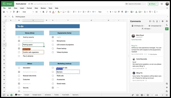
The main trade-off shows up when you need to connect Zoho Sheet outside Zoho’s own ecosystem. G2 reviewers mention it works well with Zoho apps, but some note that Excel formulas don’t always carry over cleanly when importing files, which is worth keeping in mind if your team moves between Zoho Sheet and Excel regularly.
Advanced automation also felt more limited than what I’d get from Excel or Google Sheets. Some G2 users note that deeper scripting and complex workflow automation are not as flexible here. Built-in automation helps with everyday tasks, but power users may want more room to customize.
I’d recommend Zoho Sheet for teams that want a simple, collaborative spreadsheet tied closely to business workflows. It’s especially useful if you already use Zoho apps, need cleaner data collection, or want a spreadsheet that handles routine updates without making the process feel heavier than the work itself.
What I like about Zoho Sheet:
- The built-in forms made data collection feel much cleaner, especially for campaign trackers and team-submitted updates.
- Customizing the workspace was easier than I expected, from toolbar changes to recurring report setups that didn’t need constant manual cleanup.
What G2 users like about Zoho Sheet:
“I started using Zoho Sheet a few months ago, and one thing I really liked is how neat and clean the interface feels. Compared to some other spreadsheet tools, the dashboard looks simple and organized, which makes working on sheets feel less confusing. Editing data, managing tables, and working on basic spreadsheet tasks feels smooth and easy, even for regular users or beginners. I also found it useful for keeping information organized and making quick updates without a complicated workflow. For people who want a clean and user-friendly spreadsheet tool for daily work, collabo-ration, and simple data management, Zoho Sheet feels like a good option.”
– Zoho Sheet review, Muzammil M.
What I dislike about Zoho Sheet:
- Copying formulas from Excel, may take more setup, according to G2 reviewers, though the experience is much smoother when the workflow stays within Zoho’s app ecosystem.
- G2 users mention that advanced automation can feel limited for complex use cases, but the built-in options still cover a lot of everyday spreadsheet workflows.
What G2 users dislike about Zoho Sheet:
“Some Excel formulas don’t carry over cleanly, which tripped me up a couple of times when I was importing files from Excel. And if Zoho Sheet ever has downtime, which does happen occasionally, you just lose access completely since there is no offline mode.”
– Zoho Sheet review, Pushkar N.
If Excel is starting to break under complexity, it might be time for the best FP&A tools designed for structured planning.
5. Detrics: Best for automating marketing data pipelines into Google Sheets and Looker Studio
If your reporting process still involves downloading CSVs from multiple ad platforms and stitching everything together in a spreadsheet, Detrics feels like a welcome shortcut. It’s built for marketers and agencies that want reporting to happen automatically instead of spending hours preparing data before the real analysis even begins.
The first thing I tested was how quickly Detrics could move live data into Google Sheets. Connecting Google Ads, Meta, LinkedIn, and TikTok took only a few minutes through OAuth, without needing developer support or complicated setup. During testing, scheduled refreshes ran reliably, which aligned with Detrics’ 98% score for meeting requirements on G2.
Scheduling quickly became one of my favorite features. Once I built a query, I could decide exactly how often it refreshed without touching it again. The platform also scored 99% for filtering and collaborative editing on G2, and I found it easy to organize reports while working with teammates on shared datasets.
I also found the reusable query templates surprisingly useful. After building one reporting workflow, I duplicated it for another client in seconds instead of rebuilding everything from scratch. The overall experience felt polished, which wasn’t surprising given Detrics’ 97% ease-of-use rating and 96% ease-of-setup score on G2.
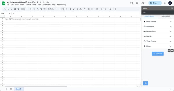
The biggest trade-off shows up when you need to connect Detrics beyond its supported connector library. G2 reviewers mention that some native integrations with other tools are missing, which means some teams may need manual imports depending on their reporting stack. The core advertising connectors are excellent, but it’s worth confirming your entire workflow before committing.
A few reviewers also mention that advanced dashboard customization can take a little more work than the rest of the platform suggests. Calculated metrics and more complex filtering may require extra exploration, although the everyday reporting experience remains straightforward once everything is configured.
I’d recommend Detrics to marketers, agencies, and freelancers who spend more time collecting marketing data than analyzing it. It won’t replace a full analytics platform, but it removes one of the most repetitive parts of reporting, leaving you with more time to focus on insights instead of spreadsheets.
What I like about Detrics:
- Watching live campaign data flow into Google Sheets without writing code made reporting feel almost effortless.
- Reusing reporting templates for multiple clients saved much more time than I expected, especially when setting up recurring dashboards.
What G2 users like about Detrics:
“I like how Detrics simplifies my report management for my agency. It makes data downloading easier and is very user-friendly. I love how easy it is to integrate and how quickly it responds. Additionally, it is cost-effective, which is a great benefit. I also appreciate that with just a few clicks I can download, organize everything, and schedule queries very simply. The initial setup was easy, it only required a couple of clicks and creating the account.”
– Detrics review, Joshua H.
What I dislike about Detrics:
- G2 reviewers mention that some popular business tools are still missing from the integration library, though the platform already covers many of the major advertising networks.
- Building more advanced dashboards can require a little experimentation, according to G2 users, but the day-to-day reporting experience remains easy to manage.
What G2 users dislike about Detrics:
“No direct integration with our local inventory management system means we still do some manual data entry.”
– Detrics review, Manuel S.
6. Coefficient: Best for connecting spreadsheets directly to business data
Coefficient solves a problem I’ve run into more times than I’d like: the business data lives in one system, the analysis happens in a spreadsheet, and someone has to keep moving information between the two. It connects Google Sheets and Excel directly to platforms like Salesforce, HubSpot, Snowflake, NetSuite, and MySQL, turning the spreadsheet into a live reporting layer rather than the final stop for another CSV export.
Getting started was refreshingly straightforward. I connected a data source, selected the fields I needed, and pulled them into a sheet without relying on a developer or building an API workflow. Coefficient scores 93% for ease of setup and 92% for ease of use on G2, which matched how quickly I moved from connection to a working report.
The connector depth impressed me more than the number of integrations. When testing HubSpot and Salesforce data, I could work with custom fields, apply filters, and pull information across related objects before it reached the spreadsheet. That gave me much more control than exporting a standard report and cleaning it afterward.
Two-way syncing was the feature that made Coefficient feel different from a typical data connector. I could update records in bulk from the spreadsheet and push those changes back to the source system. For revenue operations and finance teams managing large lists, forecasts, or account updates, this removes a surprising amount of repetitive work.
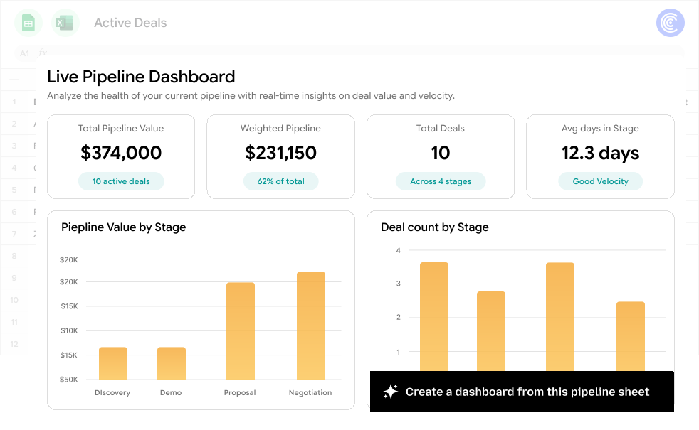
The pricing may require a closer look for smaller teams. Some G2 reviewers say the cost can feel high for lighter use cases, particularly when certain integrations or AI features require a more expensive plan. Teams using it across several data sources may find the value easier to justify, but occasional users should compare the plan limits carefully.
High-volume workflows can also need some planning. G2 users pulling hundreds of thousands of rows mention slower refreshes and limits that sometimes require workarounds. Standard reporting ran smoothly in my testing, but teams working at a much larger scale would be better off testing their heaviest dataset before rolling it out widely.
I’d recommend Coefficient for revenue operations, finance, and analytics teams that already spend most of their day in spreadsheets but need live business data behind them. Once the sheet can refresh itself and push updates back, manual exports start to feel like a workflow from another era.
What I like about Coefficient:
- Pulling filtered, cross-object CRM data directly into my spreadsheet gave me far more flexibility than working with a standard exported report.
- Bulk updates back to Salesforce made the sheet feel like an operational tool, not just somewhere to analyze what had already happened.
What G2 users like about Coefficient:
“I find Coefficient really easy to use and easy to configure, which saves our staff time on downloading reports. It’s great that we don’t have to download reports manually because they are brought in automatically. I love how simple the initial setup was, with just adding it to Google Sheets and connecting it to our Salesforce instance, allowing us to start pulling reports quickly. Using Coefficient in Google Sheets to connect our Salesforce reports and update them daily is incredibly helpful, especially since we integrate this with tools like Looker Studio.”
– Coefficient review, Ellen Dericks C.
What I dislike about Coefficient:
- Pricing is a concern for some smaller organizations on G2, although teams using several connectors regularly may get more value from the subscription.
- Reviewers working with very large datasets mention slower refreshes and row constraints, but testing the intended workload upfront can help avoid surprises later.
What G2 users dislike about Coefficient:
“It has a performance scale limit, as spreadsheets are not the best option for larger data; the human error factor would always be there”
– Coefficient review, Laxmi Y.
7. Jotform Tables: Best for organizing form submissions automatically
Most spreadsheets sit at the end of a process: collect the data somewhere else, move it over, format it, and hope nothing breaks along the way. Jotform Tables skips most of that work by sending every form submission directly into a structured table. For teams running registrations, applications, surveys, or intake workflows, that connection is the whole appeal.
I started by building a registration form and watching responses populate the table in real time. Each submission appeared as a clean, sortable row without any exports or manual formatting. Jotform Tables scores 97% for ease of use and 97% for ease of setup on G2, which matched how quickly I went from a blank form to an organized dataset.
The different view options made the same data useful in more than one way. I switched between spreadsheet, card, and calendar views depending on whether I was reviewing submissions, sharing records, or checking dates. That flexibility made the table easier to hand off to people who would rather not spend their afternoon decoding columns.
Templates also shortened the setup considerably. I tested a few prebuilt options for registrations and surveys, then adjusted the fields to match the workflow. Instead of starting from scratch, I had a working form and table in minutes, which is especially useful for non-technical teams that need to move quickly.
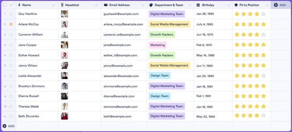
Formula support is where the experience starts to feel lighter than a traditional spreadsheet. G2 reviewers mention limitations with nested formulas, calculated fields, and more complex conditional logic. Basic calculations work well enough, but teams doing deeper analysis may still need to move the data into Excel or Google Sheets.
Dense forms can also make the resulting table harder to navigate. Some G2 users note that large numbers of fields create long rows, crowded columns, and less convenient attachment handling. Keeping forms focused helps, but more complex intake workflows may need extra organization to stay manageable.
I’d recommend Jotform Tables for schools, nonprofits, healthcare teams, and event organizers that collect a steady stream of structured information. It won’t replace a full spreadsheet for advanced analysis, but it makes everything before that stage much easier—and dramatically reduces the odds of a submission disappearing into someone’s inbox.
What I like about Jotform Tables:
- Seeing form responses arrive already organized meant I could start reviewing the data immediately instead of cleaning up another export.
- Switching the same dataset into card or calendar view made it easier to share with people who didn’t need—or want—the full spreadsheet experience.
What G2 users like about Jotform Tables:
“I really appreciate the intuitive interface and how it automatically populates responses into a spreadsheet-like format. The ability to filter, group, and customize views makes it incredibly flexible for both simple and complex workflows.”
– Jotform Tables review, Ramiro B.
What I dislike about Jotform Tables:
- G2 reviewers say advanced formulas and calculated fields can feel limited, though the tool still handles straightforward form-based tracking well.
- Users managing long, field-heavy forms mention that tables can become crowded, but a tighter form design can keep the workflow easier to navigate.
What G2 users dislike about Jotform Tables:
“What I dislike about Jotform Tables is that some advanced features feel limited, especially when trying to set detailed rules or quotas. It can take workarounds to achieve more complex workflows.”
– Jotform Tables review, Verified User in Real Estate
Finding spreadsheet software is good, but knowing how to analyze data is what matters. Whether you’re working with sales numbers, marketing performance, or financial forecasts, understanding descriptive statistics can help you turn raw numbers into real insights.
8. Minitab Statistical Software: Best for statistical analysis and quality improvement
Minitab Statistical Software doesn’t pretend to be an everyday spreadsheet, and that’s exactly the point. While testing it, I quickly realized it was built for people who need answers from their data, not just a place to organize it.
The first thing I tried was predictive analysis using historical sales data. Instead of building formulas and forecasting models manually, I used Minitab’s regression tools to generate projections in a few clicks. The output included confidence intervals, visualizations, and statistical summaries that helped explain the results instead of simply displaying them. It also scores 93% for meeting requirements on G2, which felt well deserved.
Quality improvement is another area where Minitab stands out. I imported production defect data and tested control charts, Pareto charts, and process capability analysis. Rather than figuring out which chart to build myself, Minitab guided me toward the right statistical method. That saved time and made the analysis feel much more approachable.
I also appreciated Minitab’s Assistant. It walked me through statistical tests step by step and explained why each method fit the data. Even with some analytics experience, I found it useful for validating my approach instead of second-guessing whether I had picked the right test.
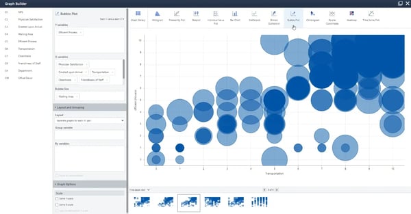
Minitab expects structured data, and that takes a little getting used to. G2 reviewers mention that the learning curve can feel steep if you don’t have a statistical background. The Assistant certainly helps, but it’s still a tool that rewards some familiarity with analytics concepts.
Collaboration also feels different from cloud-based spreadsheet tools. Some G2 users note that sharing and working together isn’t as seamless as platforms like Google Sheets. That’s understandable given Minitab’s focus on statistical analysis rather than team editing, but it’s something to keep in mind if collaboration is a priority.
I’d recommend Minitab for analysts, engineers, researchers, and quality teams who spend more time interpreting data than organizing it. If your work revolves around statistical accuracy instead of spreadsheet flexibility, Minitab offers tools that general-purpose spreadsheets simply don’t.
What I like about Minitab Statistical Software:
- Running regression analysis and forecasting felt much faster because the software handled the statistical heavy lifting while still explaining the results clearly.
- I found the quality control tools especially useful since they pointed me toward the right analysis instead of making me build every chart from scratch.
What G2 users like about Minitab Statistical Software:
“What I value most about Minitab is its intuitive Design of Experiments (DOE) module, which makes creating and analyzing complex multi-variable factorial designs incredibly straightforward. The wizard for setting up factors and runs saves hours of initial planning compared to manual coding. Once the experimental data is collected, the automated analysis tools—like the ANOVA outputs, main effects plots, and Pareto charts—make identifying significant process parameters highly efficient. The software provides great performance with fast processing times even when handling larger datasets, and the user interface strikes a great balance between rigorous statistical power and clean accessibility.”
– Minitab Statistical Software review, Nikhil C.
What I dislike about Minitab Statistical Software:
- G2 reviewers mention that new users may need time to get comfortable with the statistical concepts, though the built-in Assistant does a good job of easing that learning curve.
- Some G2 users say collaboration isn’t as streamlined as cloud-based spreadsheet tools, but that’s a reasonable trade-off for software designed primarily around advanced statistical analysis.
What G2 users dislike about Minitab Statistical Software:
“Minitab’s main drawbacks are its dated-looking interface, limited visualization and customization options, a high licensing cost for occasional users, restricted advanced AI or machine-learning features, and relatively few direct integrations beyond Excel and basic data files.”
– Minitab Statistical Software review, Ajay K.
If you want to turn raw data into beautiful, interactive dashboards, you’ll need the right tool. Luckily, I’ve also tested the best free dashboard software to help you visualize your data like a pro.
Frequently asked questions about best spreadsheet software
Have more questions? Find more answers below.
Q1. What is a spreadsheet program?
A spreadsheet program is software used to organize, calculate, analyze, and visualize data in rows and columns. It can support formulas, charts, tables, automation, collaboration, financial tracking, reporting, and database-like workflows.
Q2. What is equivalent to Excel for Mac?
Apple Numbers is Apple’s native spreadsheet program and a straightforward Excel alternative for Mac users. It works well for visual reports, dashboards, trackers, and everyday calculations, although Microsoft Excel remains the stronger option for advanced financial modeling and large-scale analysis.
Q3. What is the best free spreadsheet software?
Google Sheets is the best free spreadsheet software for most users because it combines real-time collaboration, cloud access, autosave, formulas, integrations, and lightweight automation. Apple Numbers is another strong free option for Mac users who prioritize visual presentation.
Q4. What are the best spreadsheet solutions for mid-market teams?
Google Sheets, Microsoft Excel, Zoho Sheet, Detrics, and Coefficient are strong spreadsheet solutions for mid-market teams. Google Sheets supports collaborative work, Excel handles advanced analysis, Zoho Sheet fits teams using Zoho applications, and Detrics and Coefficient automate data connections and reporting.
Q5. What are the highest-rated spreadsheets for team success?
Google Sheets, Microsoft Excel, Detrics, and Coefficient are among the highest-rated options for team success. Google Sheets is particularly effective for real-time collaboration, while Detrics and Coefficient help teams reduce manual reporting and keep business data connected to their spreadsheets.
Q6. What are the most reliable spreadsheet platforms for enterprises?
Microsoft Excel is one of the most reliable spreadsheet platforms for enterprises because it handles large datasets, advanced formulas, financial modeling, Power Query, Power Pivot, and automation. Google Sheets is also a strong enterprise option for cloud collaboration, while Coefficient helps connect spreadsheets to systems such as Salesforce, HubSpot, Snowflake, and NetSuite.
Q7. What are the most trusted spreadsheets based on user reviews?
Google Sheets, Microsoft Excel, Detrics, Coefficient, Zoho Sheet, and Minitab Statistical Software are highly trusted based on G2 user reviews. The right choice depends on whether the priority is collaboration, advanced analysis, business-data integration, automated marketing reporting, or statistical modeling.
Q8. What are the most trusted spreadsheets among professionals based on reviews?
Professionals frequently trust Microsoft Excel for advanced analysis and financial modeling, Google Sheets for collaboration, and Minitab for statistical analysis. Coefficient and Detrics are also well regarded by operations, finance, analytics, and marketing professionals who need automated data workflows.
Q9. Which spreadsheet software is trusted by professionals?
Microsoft Excel, Google Sheets, Apple Numbers, Zoho Sheet, Detrics, Coefficient, Jotform Tables, and Minitab Statistical Software are trusted by professionals across different use cases. Excel and Google Sheets suit broad business needs, while the other platforms address more specialized workflows.
Q10. Which spreadsheet solutions have the best ease of setup?
Google Sheets, Zoho Sheet, Detrics, Jotform Tables, and Coefficient are among the easiest spreadsheet solutions to set up. Jotform Tables and Detrics are especially quick for form-based data collection and marketing reporting, while Google Sheets and Zoho Sheet are easy to adopt for everyday team workflows.
Q11. What are the top spreadsheet platforms for enterprise teams?
Microsoft Excel, Google Sheets, Coefficient, and Minitab Statistical Software are strong options for enterprise teams. Excel supports complex analysis, Google Sheets enables cloud collaboration, Coefficient connects spreadsheets to business systems, and Minitab handles advanced statistical and quality-improvement work.
Q12. Which spreadsheet platforms integrate with existing systems?
Coefficient integrates with systems such as Salesforce, HubSpot, Snowflake, NetSuite, and MySQL. Detrics connects marketing platforms to Google Sheets and Looker Studio, while Zoho Sheet integrates closely with Zoho applications. Google Sheets and Microsoft Excel also support broad integrations through add-ons, APIs, Apps Script, Power Automate, and other ecosystem tools.
Q13. Which spreadsheet platforms scale for growing teams?
Microsoft Excel, Google Sheets, Zoho Sheet, Coefficient, and Detrics can scale with growing teams. Excel supports increasingly complex analysis, Google Sheets makes collaboration easy, Zoho Sheet fits expanding Zoho-based workflows, and Coefficient and Detrics automate reporting as data sources and client accounts increase.
Q14. What is the best spreadsheet software for documenting options trades?
Microsoft Excel is the best spreadsheet software for documenting options trades because it supports advanced formulas, tables, filtering, forecasting, large datasets, and financial modeling. It can be used to track strike prices, expiration dates, premiums, profits and losses, and portfolio performance in a customizable workbook.
Formula for thought
After testing all these spreadsheet tools, one thing is clear — no single spreadsheet is perfect for everyone. Some excel (pun intended) at data analysis and automation, while others shine in collaboration, visualization, or seamless integration with business tools. I found that each tool had its own strengths, depending on how much control I needed over my data, how often I worked with a team, and whether I wanted built-in intelligence to do the heavy lifting for me.
If I need powerful analytics and automation, some tools handle massive datasets and complex formulas without breaking a sweat. If collaboration is my top priority, cloud-based spreadsheets make sharing and real-time editing more effortless than ever. When I want something more visually polished for reporting, there are options that make my spreadsheets look less like raw data and more like a well-designed presentation.
The only real way to know which one works best is to try them out. Most of these tools offer free versions or trials, and I found that actually working with them gave me a much better sense of what felt natural and what slowed me down. At the end of the day, a spreadsheet should make my life easier, not harder, so it’s worth finding the one that fits how I work.
Check out my team’s recommendation of the best data visualization software to transform your spreadsheets into interactive charts, dashboards, and reports.

💸 Earn Instantly With This Task
No fees, no waiting — your earnings could be 1 click away.
Start Earning
